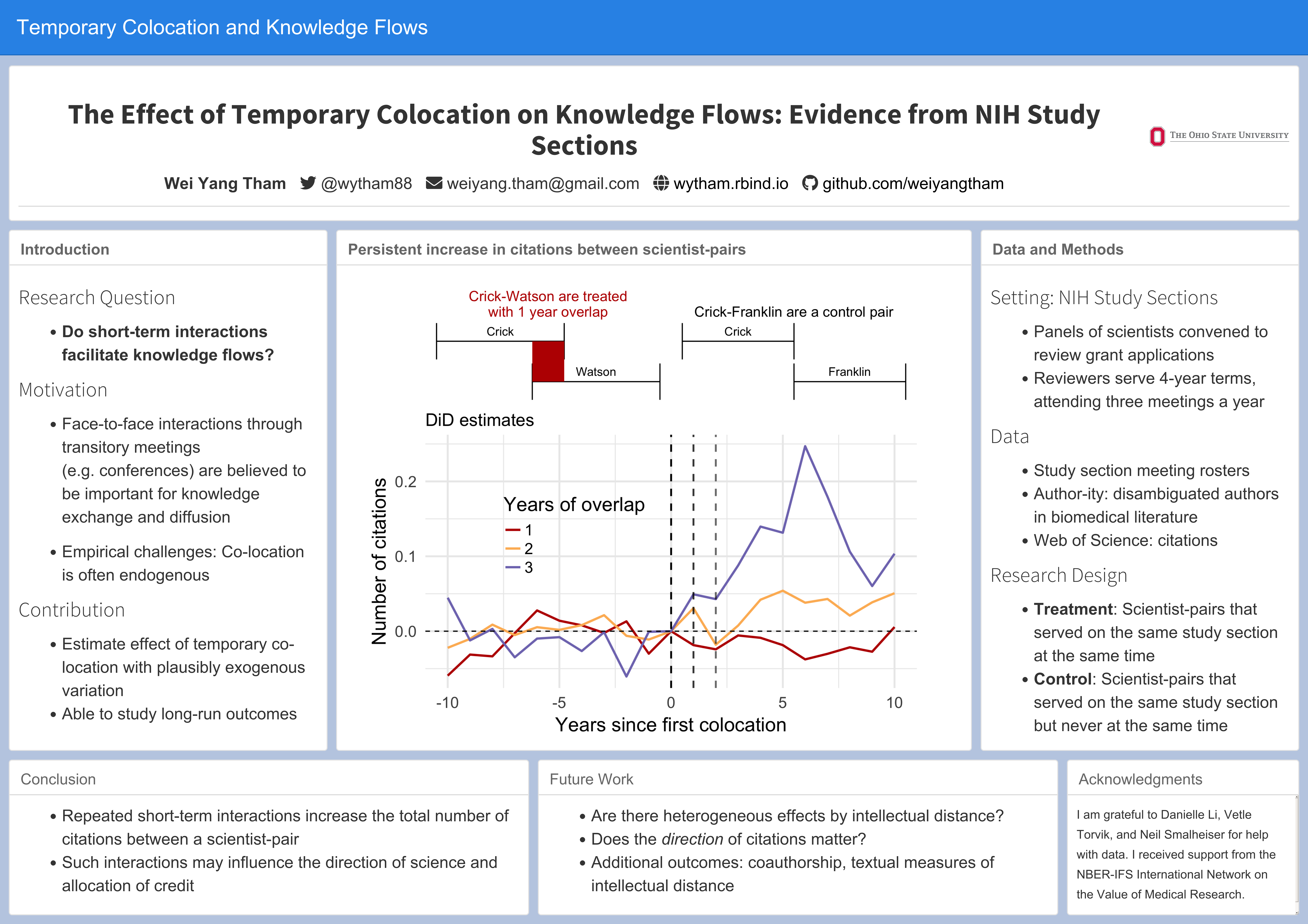
I just attended the SOLE (Society of Labor Economists) 2018 conference and was very lucky to get to present a poster there.
While making my poster, I relied heavily on the principles in this blog post by Tullio Rossi.1
The main area where I found the Rossi post lacking was on software. All the suggestions he makes (e.g. Powerpoint, Canva, Adobe Illustrator) are point-and-click. I have nothing against using point-and-click software to make a poster, so if it works for you then go ahead. I’m just so used to leaving typesetting and formatting to the computer that there are a lot of details I don’t want to worry about.
On the other hand, doing your poster in something like LaTex or R Markdown leaves you less room for customizability, which could limit you from making a great poster. However, I think you can still make a good poster that is clear, readable, and pleasant to look at. With that, here’s how you can make a poster in R, plus some tips for customization. I’ve made the code available in a Github repo.
1 Essentials
1.1 Use the postr package
devtools::install_github("odeleongt/postr")The postr package allows you to create a poster in R Markdown. It uses flexdashboard to create a poster layout and then takes a screenshot of the html output.
A couple of things that might help you get going quicker:
Set
render_printin the YAML header tofalseso that when you “Knit” the R Markdown document in RStudio, this produces only the html file and not the screenshot.Then to generate the image file (you’ll send this to the poster printer), run
postr::render("path/to/poster.html"). Use theaspect_ratioandposter_widtharguments to set your poster size and dimensions.
1.2 Make sure your graphs have the right dpi
I still don’t know what “dpi” stands for, but basically it makes sure your images still look crisp after they blown up for the actual poster. The default dpi in R Markdown is 72, but for printing you want to set it to 300. If you’re generating the image from within the R Markdown document, you can do that with ```{r, dpi=300} in your code chunk options. If you’re using an externally generated image (i.e. linking to an image file generated from code somewhere else), you’ll have to take care of the dpi settings wherever you’re generating the image.
A quick check to make sure you have the right dpi is to just zoom in on your poster and make sure the words and images stay crisp.
2 The little things
2.1 Font Awesome icons
If you want to have the neat little icons next to your contact information (like the twitter bird ), download Font Awesome (free). You’ll get a bunch of folders and files - find the fontawesome-all.css and copy and paste it somewhere, and point to that file in the YAML (e.g. see below).
output:
  postr::flex_dashboard_poster:
    render_print: false
    css: ["resources/fontawesome-all.css"]
Example: To generate the twitter icon, insert <i class="fab fa-twitter" aria-hidden="true"></i> into wherever you want it on your document. Just google “Font Awesome X icon” to find the code for the icon you need (that’s the “fab fa-twitter” part).
2.2 Background color
A great suggestion I got while presenting earlier drafts of my poster was to change the default postr background so that the white panels would “pop” better. You can do this by creating a .css file and with the following code:
body{
  font-family: "Arial"; # you can specify the font too
  background-color: #b3c3de; # hex for background
}
I settled on a not too saturated blue (so that it would matched the banner) but still darker than the default light grey, but feel free to play around with it. You can point to multiple css files in the YAML with
css: ["resources/fontawesome-all.css", "sole2018.css"]2.3 Use Viz-Palette to choose graph colours
I’ve become a big fan of Viz-Palette by Susie Lu and Elijah Meeks. Essentially you give it a list of colors and it shows you how they look on different kinds of graphs (line, area, network etc.). The idea is that different sets of colors work differently on different kinds of graphs, so you may want to make adjustments to your color palette accordingly. You can also see how the colors look for different forms of color blindness.
I’m not experienced with colors but I’m trying to get better. To make it easy, I started out with a palette from ColorBrewer (http://colorbrewer2.org/) and then pasted the hex codes into Viz-Palette to see how they looked. From there I made slight adjustments within Viz-Palette to get what I wanted, mainly increasing the saturation to stand out better against the white background. When you’re happy with the colors, copy the hex codes and apply them to your graph (if you’re using ggplot2, this would be with the scale_X_manual family of functions).
2.4 Text size
Every one who makes a poster is tempted at some point to shrink their font size or reduce line space to fit more text in. You should do this with caution since that risks hurting the readability of your poster.
In postr you have options to create a panel that has a smaller font e.g. ### Title of Small Panel {.small}. If you want even more control over text size (e.g. only change the size of a specific sentence or the default sizes aren’t working for you), you can use html tags e.g. <small> This sentence is for ants. </small>. Google “html text size” for more options.
2.5 Making diagrams and integrating them with your graphs
Just above my main graph, I have a diagram that illustrates my research design. Obviously this specific diagram is not something that posters generally need, but it’s a nice example of how you can make a customized diagram with ggplot2 without having to make point-and-click drawings. This way you don’t have to worry about placing something off-center when you wanted it to be perfectly centered, or having two lines be at 89 degrees when they should have been 90.
The point of the diagram is to show two scientists (Crick and Watson) serving as reviewers on a grant review panel whose terms as reviewers overlap even though they start at different times. I used error bars to create the intervals, flipped the axes (coord_flip) to make them horizontal, and used annotate to highlight the area of overlap.
library(tidyverse)

leftlabel =
  tribble(
    ~x, ~y, ~label,
    3.25, -1, "Crick",
    2.25, 2, "Watson"
  )

leftterms =
  tribble(
    ~x, ~start, ~end,
    3, -3, 1,
    2,  0, 4
  )

pleft = ggplot() +
  geom_text(data = leftlabel, aes(x = x, y = y, label = label)) +
  geom_errorbar(data = leftterms, aes(x, ymin = start, ymax = end)) +
  coord_flip() +
  theme_void() +
  annotate("rect",
           xmin = 2, xmax = 3, ymin = 0, ymax = 1,
           alpha = 1, fill = "#bb1200") +
  labs(title = str_wrap("Crick-Watson are treated with 1 year overlap", 25)) +
  theme(plot.title = element_text(hjust = 0.5, colour = "#bb1200")) +
  NULL

pleft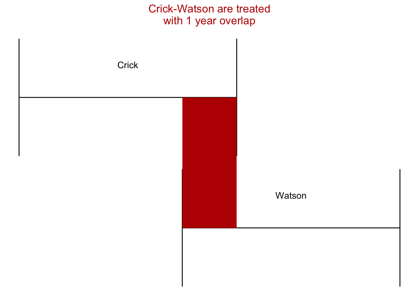
Finally I put the diagrams and graph together with patchwork.
library(patchwork)
(pleft | pright) / coefplot + plot_layout(ncol = 1, heights = c(1, 3))
2.6 Delaying the screenshot2
Since the poster is generated by taking a screenshot of an html, you might end having screenshots taken of messages that pop up while the html is being loaded. For example, if you have any LaTex equations with some complexity, you could get a message like “Processing math: 100%” come up in the bottom left corner.
You can deal with this using the delay argument in postr::render(). E.g. postr::render("poster.html", delay = 10) waits 10 seconds before taking a screenshot of the html.
3 Should you do a poster?
The success of a poster session is often dependent on factors beyond your control, particularly whether conference organizers send the appropriate signals e.g. not scheduling other sessions at the same time. If those conditions are met, then I see the poster as doing two things.
- It forces you to identify the central message of your research and deliver that in a short amount of time (what is my sales pitch?)
- It forces you to think of the best way to condense your research visually (how can I tell my story in 1-2 pictures?)
The ideas you get from having to do these things could eventually end up being useful in a longer presentation or the paper itself. For example, I’m pretty sure the Crick-Watson diagram I made will end up in a future presentation. If nothing else, at least you’ll have killer calves after standing for an hour and a half straight.